
The surge in online mobile traffic means that users are using the phone applications more than ever before. Users demand high performance and also good quality design. Poorly designed mobile apps are boring and they are a huge turn-off for users. An exceptionally designed mobile app has good aesthetics, and is responsive to give a smooth experience.
Users will associate your mobile design with your brand. It makes it critical to protect your reputation by delivering a high quality product. The user interface (UI) should be consistent with your brand including aspects such as logos and colors.
We present you the UI mobile design trends you should follow in 2024.
Minimalist approach
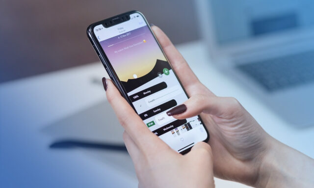
In any design philosophy, a minimalist approach always wins. Your design does not have to be complex to deliver a message regarding your products and services. Your mobile UI should be simple and direct for efficient delivery. Some of the most popular apps, such as Instagram or WhatsApp use simple interfaces, and that’s what you should aim for.
A minimalist UI creates a good information flow as everything is clear and straightforward. A user will use less time navigating through the app to find what they need. They won’t need extensive instructions on how to use the site, like through tutorials.
Migrate from 2D to 3D
3D graphics are now more likely to guarantee you better results than 2D. Even though 2D is still relevant for some parts of the UI, you should aim to add 3D graphics to your mobile app. You do not need to create everything from scratch, as you can find a host of them in online libraries. All you have to do is to edit them to fit your UI.
Leveraging technologies such as 3D graphics gives you a competitive advantage over your rivals. You’ll also deliver exceptionalmobile app design and experience to your users.
Use a splash screen
It is a must-have feature on your mobile app. It delivers valuable information to your users. You should include the app version, the loading animation and the logo. You can also add startup tips to help users know more about your app.
The splash screen design should be consistent with the other design elements in your app. For example, the logo, and the colors should match.
Text alignment and typography
You can play around with them to achieve an intuitive design in the UI. The recent trends involve avoiding skeuomorphic design and using a more conversational interface. You can be as creative as you like with the typography. Each time you change it, look out for the user reaction.
Experimenting on typography is limitless. For example, one of the most popular trends at the moment is using unconventional text alignment. It adds a creative touch to your mobile UI and boosts the legibility of text.
Use a simple registration interface
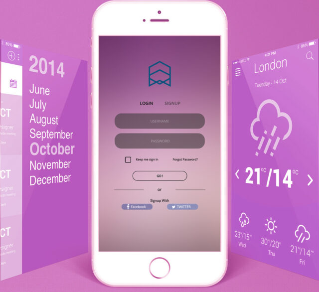
It is almost impossible for a user to only have one app on their phones. You do not want to keep them waiting by having a long registration process. Use a simple and straightforward interface which they can fill in fast and they can be on their way.
There are now simpler registration options, for example, through LinkedIn, Google, Facebook or Twitter. Incorporate these, and it’ll save your website visitors a lot of time and effort.
Functionality
It is a trend as well as a compulsory of your UI mobile design. The UI won’t be intuitive if the functionality of the overall system is not in check. Aspects to consider in functionality include ease of use, simple interface and loading speed. It allows users to navigate easily to access the components of the UI design.
Consequently, you benefit from better interaction from the users which increases the conversions while attracting a bigger audience. Functionality includes even the smallest elements such as separating the content colors from the background splash. There is no limit to how creative you can be. The key issue is to maintain clarity and simplicity through the UI mobile design.
Asymmetry
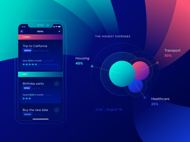
Your UI mobile design should balance between asymmetry and symmetry. It is a popping trend, even though asymmetric designs have been around for centuries. It is applied in UI mobile design to create a suiting layout to increase its visual appeal. It achieves this by combining different shapes, sizes, colors and fonts.
The UI mobile design will stand out because of its uniqueness. Asymmetrical designs are now popular unlike the traditional layout designs which are rigid. They provide infinite ways to structure UI mobile design. That’s why it is common to find unique layouts in almost all mobile designs coming out at the moment.
Voice user interface
The world of AI is taking over and users are now comfortable talking to their virtual assistants on their phones. Popular virtual assistants are Apple’s Siri, Google Assistant, Amazon’s Alexa and Windows’ Cortana. It makes sense to include voice commands as part of your UI mobile design to keep up with the changing trend. The change is catching up with user interface design, which prompts you to take advantage of the revolution.
Dark mode
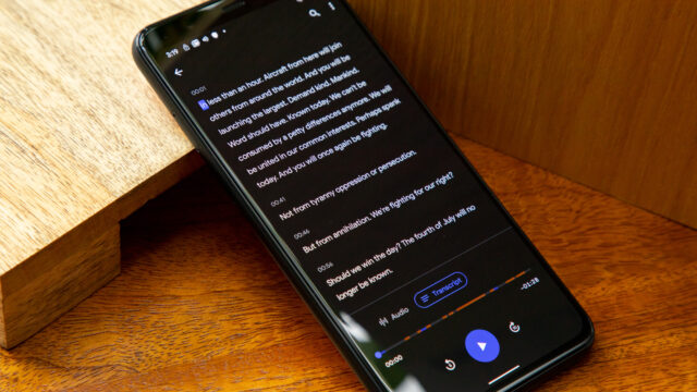
It can seem like a simple aspect but statistics show that more users now want dark mode themes on their UI mobile design trends. Majority of mobile applications, websites and search engines are adopting this trend. You can find it in popular apps such as WhatsApp, Instagram and on the Google search engine.
It is something you should definitely not miss out on. The trend was nonexistent until the launch of Windows Phone OS. Users could use the theme through the operation system. It caught the eye of users and developers. Currently it is a must-have on any UI mobile design.
Final thoughts
As you start or continue your mobile app UI design, you should adopt these trends to achieve efficiency and exceptional structure. Alpha Efficiency pays attention to the top UI mobile design trends. They are useful to guide design processes and also deliver intuitive design to clients.


